• Portfolio
  • RESUME
  • About
Menu

Noel Adolph

  • Portfolio
  • RESUME
  • About

ART DIRECTION + BRAND CAMPAIGNS

Greatest Hits Vol. 1

From Clorox to Keith Urban to the LOS ANGELES Times

Freelance art director based in California. I lead creative from concept through
production (including packaging, campaigns, retail and experiential) for CPG,
entertainment and media clients.

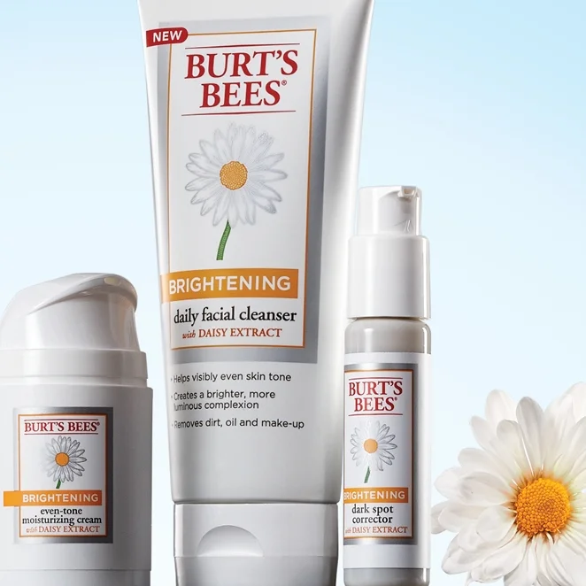
Burt's Bees

To launch their brightening line, Burt's Bees wanted an advertorial to run adjacent to a full-page ad in major women's lifestyle magazines. Working with the marketing team, we developed the creative to look like it could come from any of the magazines' editorial departments, but maintains the essence of the Burt's brand. The products were arranged on natural surfaces and lit to give them a heroic and dramatic introduction to the reader. 

AD: Noel Adolph
CW: Perry Portugal
Photography/Retouch: i4Color/Ron Essex

eeee3415117407.5628f44457a08.jpg

Glad MatchWare

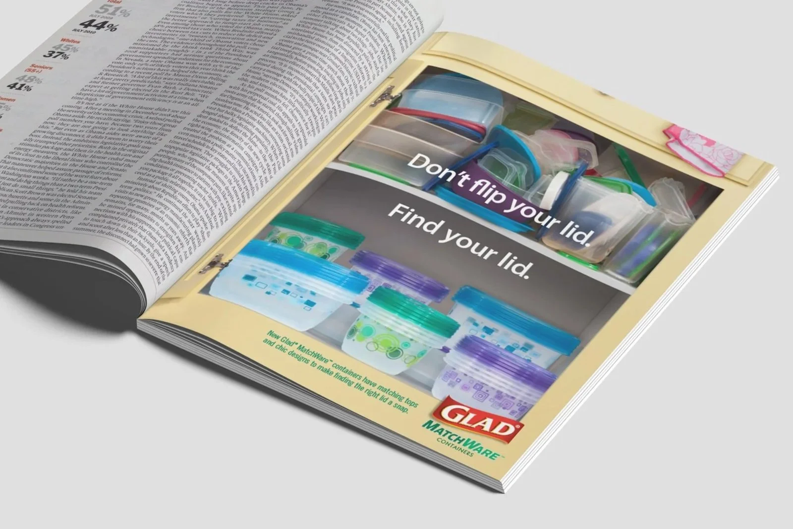
Everybody has one. A drawer or cabinent full of mismatched, warped containers that never seems to stay organized, no matter what we try. After considering several different options, it was clear that relating to the consumer's frustration and helping them put an end to this common problem was the best way to introduce a new line of Glad MatchWare that uses color-coordinated tops and designs to make finding the right lid a snap, even if your cabinent hasn't been neatly organized.

AD: Noel Adolph
CW: Perry Portugal
CD: Bruce Willardson
Photography/Styling: i4Color

glad-matchware-mockup.jpg
glad_ware_ad.jpg

Burt's Bees

Burt's Bees wanted to test a kiosk strategy for Holiday 2012 using pre-fabricated kiosk units, skinning the kisoks to look and feel like actual Burt's Bees stores. Working with the client, we developed a faithful interpretation of their retail concept that still felt true to the brand, from the actual skin of the kiosk itself to the individual signs posted around the kiosk.

AD: Noel Adolph
Copy: Perry Portugal
CD: Bruce Willardson

burts_kiosk1.jpg
burts_kiosk2.jpg
burts_kiosk3.jpg
burts_kiosk4.jpg

Kingsford

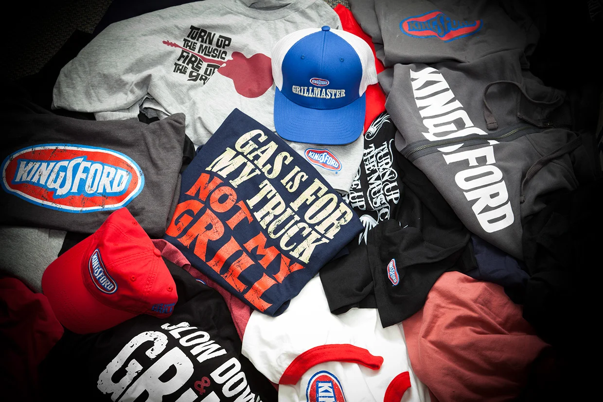
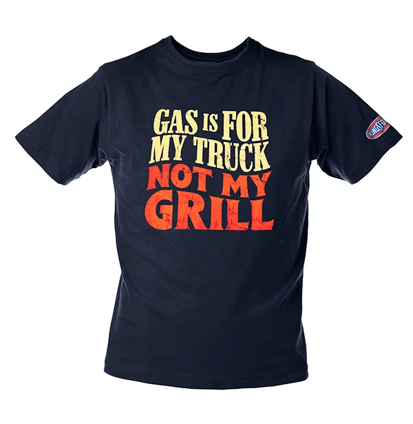
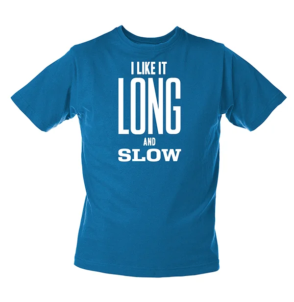
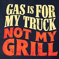
Kingsford Charcoal expanded their brand into more of the lifestyle space, giving me the perfect opportunity to indulge my love of typography. Original designs were printed in small batches and test marketed at Memphis in May, a huge barbecuing competition. Interacting with consumers one-on-one gave the client and myself immediate feedback on which designs would work. The most successful designs were refined and produced for sale on kingsford.com, where sales of the branded products have continually exceeded client expectations. 

AD: Noel Adolph
CW: Noel Adolph

64431f12137927.56257e28e26d6(1).jpg
dbf87312137927.56257de647d03.jpg
ccecfa12137927.56257e5b93162.jpg
6a9a7b12137927.56257dc04aab5.jpg

Hidden Valley Farmhouse Originals

Expanding Hidden Valley brand to it’s first-ever line of Italian and Vinaigrettes created an opportunity to reinforce the brand’s ranch heritage while maintaining a fresh and current image.

Photographing the product against a background with subtle reference to the iconic ‘valley’ pictured on the label (blue sky, field), along with other farm fresh cues like fresh picked lettuce and plenty of weathered wood. Real basil, oregano and garlic are highlighted ingredients in all communications as a point of differentiation between Hidden Valley and other brands.

AD: Noel Adolph
CW: Perry Portugal
CD: Bruce Willardson
Photo/Retouch: i4Color/Ron Essex

 Hidden Valley Originals Launch Ad

Hidden Valley Originals Launch Ad

 Facebook Coupon page

Facebook Coupon page

 HV Originals FSI

HV Originals FSI

Clorox Bleach

For the introduction of the next generation of bleach, we wanted to bring a fresh perspective to the brand that would appeal to the way consumers use bleach today. The sales kit look and feel owes a lot to other products today’s consumers are familiar with, giving it a clean uncomplicated feel. Materials, finishes, photography and copy were selected to highlight the changing of such an iconic brand into a product that has been rethought from the ground up to meet today’s challenging lifestyles. The sales kit features current touches like magnetic closures and a European-style handle, and the enclosed magazine and Gen B manifesto poem printed on the back serve to rally the sales force and customers around the new generation of bleach.

AD: Noel Adolph
CW: Perry Portugal
CD: Bruce Willardson
Photo/Retouch: i4Color

CLB1.jpg
 NOW Cover. The included brochure was designed to look like a hip fashion magazine, which explained the new positioning for Gen B Clorox.

NOW Cover. The included brochure was designed to look like a hip fashion magazine, which explained the new positioning for Gen B Clorox.

 Spread from brochure.

Spread from brochure.

 Spread from brochure.

Spread from brochure.

 Spread from brochure.

Spread from brochure.

 Spread from brochure.

Spread from brochure.

 To introduce the kit to the salesforce, we arranged for Dimensions, an Oakland dance troupe Clorox sponsored, to perform at the kickoff event. Custom costumes were created to reflect and reinforce the color scheme of the kit.

To introduce the kit to the salesforce, we arranged for Dimensions, an Oakland dance troupe Clorox sponsored, to perform at the kickoff event. Custom costumes were created to reflect and reinforce the color scheme of the kit.

Armor All Butter Wax

All too often, car wax advertising focuses on the end result. Since Butter Wax was such a revolutionary advance in the time it takes to achieve this result, we wanted to make that the point of differentiation, literally shattering the speed limit of application time. The eye-catching visuals instantly convey the product benefits (speed/water beading) without the need for explanatory text, resulting in a successful launch of the product.

Art: Noel Adolph
Copy: Perry Portugal
CD: Bruce Willardson
3D modeling: i4Color/Steve Barrett

butterwax1.jpg
butterwax2.jpg

Laura Bakes

Laura is a delightful client with loads of energy, talent and humor. When she expressed her desire to take her home-based baking business to the next level, it didn’t take long to develop the name and strategy. In developing the name and logo, I really wanted the same fun and quirkiness you experience when talking to her to come across. From there, fun geometric patterns, pop-art colors and playful copy all combined to make the identity an extension of the person herself, applied to everything from business cards and signage to packaging for her signature cupcakes.

AD: Noel Adolph
CW: Noel Adolph

 Laura Bakes identity

Laura Bakes identity

 Signage

Signage

 Baked-goods packaging

Baked-goods packaging

 Business card

Business card

KC Masterpiece/Kingsford

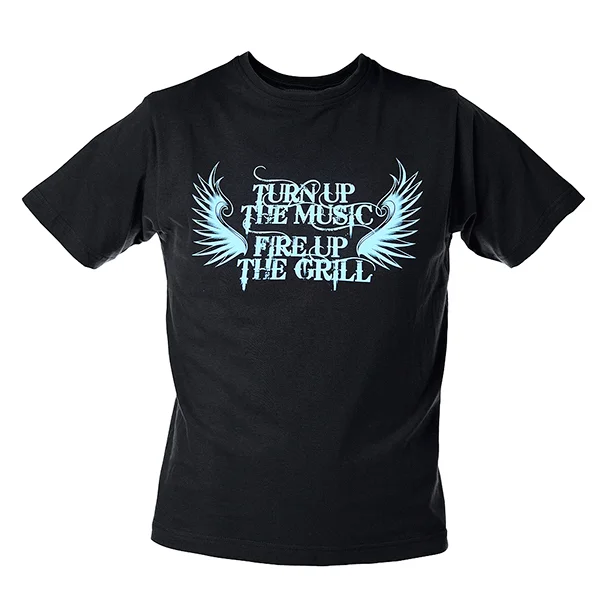
KC Masterpiece entered into country music sponsorship with a bang. Together with sister brand Kingsford Charcoal, the brand decided Keith Urban was exactly the right musician to deliver the message of “Turn Up the Music, Fire Up the Grill” to country music fans (most of which also like to grill quite often). Working with photographer Danny Clinch, we wanted to capture an image of Keith and his friends with their families enjoying an afternoon by the grill while out on tour, playing around and having a picnic that could be used at retail, at VIP concert meet and greets, and web promotions that gave a sense of story and togetherness. The campaign was used successfully for 2 different concert tours, utilizing the hero image and other graphics both years to help Keith and his fans turn up the music and fire up the grill.

AD: Noel Adolph
CW: Noel Adolph
CD: Bruce Willardson
Photography: Danny Clinch
Retouching/compositing: Tom Hamilton

1urban1.jpg
1urban2.jpg
3e6a376585911.5633b75c9d43a.jpg

Clorox Bleach

How do you make a 93 year old brand relevant to the Mad Men audience? To make the Clorox brand of bleach relate directly to the show, the creative team focused on matching the tone and themes of the show. We chose a white shirt, collar undone, then inserted a lipstick smudge on the collar. The image is accompanied by the line “Getting ad guys out of hot water for generations” and a simple picture of a bottle of Clorox Bleach. A companion video ID tag was created for the DVD series as well, bringing the print insert to life.

Our ad even caught the attention of The New York Times, “The other spot shows a man’s white shirt with a lipstick stain on the collar. Office noises can be heard on the soundtrack, followed by the clattering of a typewriter as these words appear on screen: “Getting ad guys out of hot water for generations.” The shirt spot was created internally at Clorox and the laundry spot was created by the San Francisco office of DDB Worldwide, part of the Omnicom Group.

The Clorox commercials “speak to the longevity of the brand,” said Anne Parducci, executive vice president for marketing at Lionsgate Home Entertainment, which is possible because the plots of “Mad Men” take place in 1960 (season one) and 1962 (season two).”

AD: Noel Adolph
CW: Perry Portugal
CD: Bruce Willardson

63561f50954727.56089ecfe0473.jpg
Lipstick

STP

To celebrate its long-standing relationship with Richard Petty Racing, STP wanted to create a series of ads that celebrated Team Petty’s accomplishments and STP’s heritage as the brand of choice among ‘car guys’. Three archival photos were used as a starting point to illustrate universal truths that all car guys care about their cars, with Richard Petty and Mario Andretti being positioned as archetypal ‘car guys’.

AD: Noel Adolph
CW: Noel Adolph
CD: Bruce Willardson
Photo: GettyImages

STP_PERRY1.jpg
STP_PERRY2.jpg
STP_PERRY3.jpg
STP_PERRY4.jpg

The Clorox Foundation

Searching for a redesigned look and feel to help boost sagging participation, The Clorox Company Foundation annual GIFT campaign needed an identity that would be a forceful reminder to employees of the good that contributing to the campaign does. Since it touches the heart of so many varied parts of the community (arts & culture, education, environment, etc), making the main visual a heart made up of the different community efforts seemed to make the most sense. The refresh had a huge impact on participation, jumping 13% in the first year and increasing from there every year since.

AD: Noel Adolph
CW: Noel Adolph
CD: Bruce Willardson

CLX_FOUND_HEART.jpg
CLX_FOUND_HEART_1.jpg
2009GiftCampaign_1_1108.jpg
2009GiftCampaign_4_1108.jpg
2009GiftCampaign_10_1108.jpg
2009GiftCampaign_11_1108.jpg
2009GiftCampaign_23_1108.jpg
2009GiftCampaign_32_1108.jpg

Clorox Commercial Products

To provide a disruptive counterpoint to most medical community advertising, these CDIFF focused ads maintained a cleaner, simpler look and feel. The copy of all the ads playfully engages the audience with the facts, then pays off with subheadlines suggesting CDIFF’s point of view. Terminal wipes were given their own half-page ad, clearly illustrating the reduction of steps to just one that the product enables. The clarity of the ad was honored by the American Journal of Infection Control for Advertising Excellence.

AD: Noel Adolph
CW: Perry Portugal
CD: Bruce Willardson
Photo/Retouching: i4Color

CDIFF_!.png
CDIFF2.jpg
prev / next
Back to Greatest Hits Vol. 1
drone-light-show-1080x1350-hero.png
0
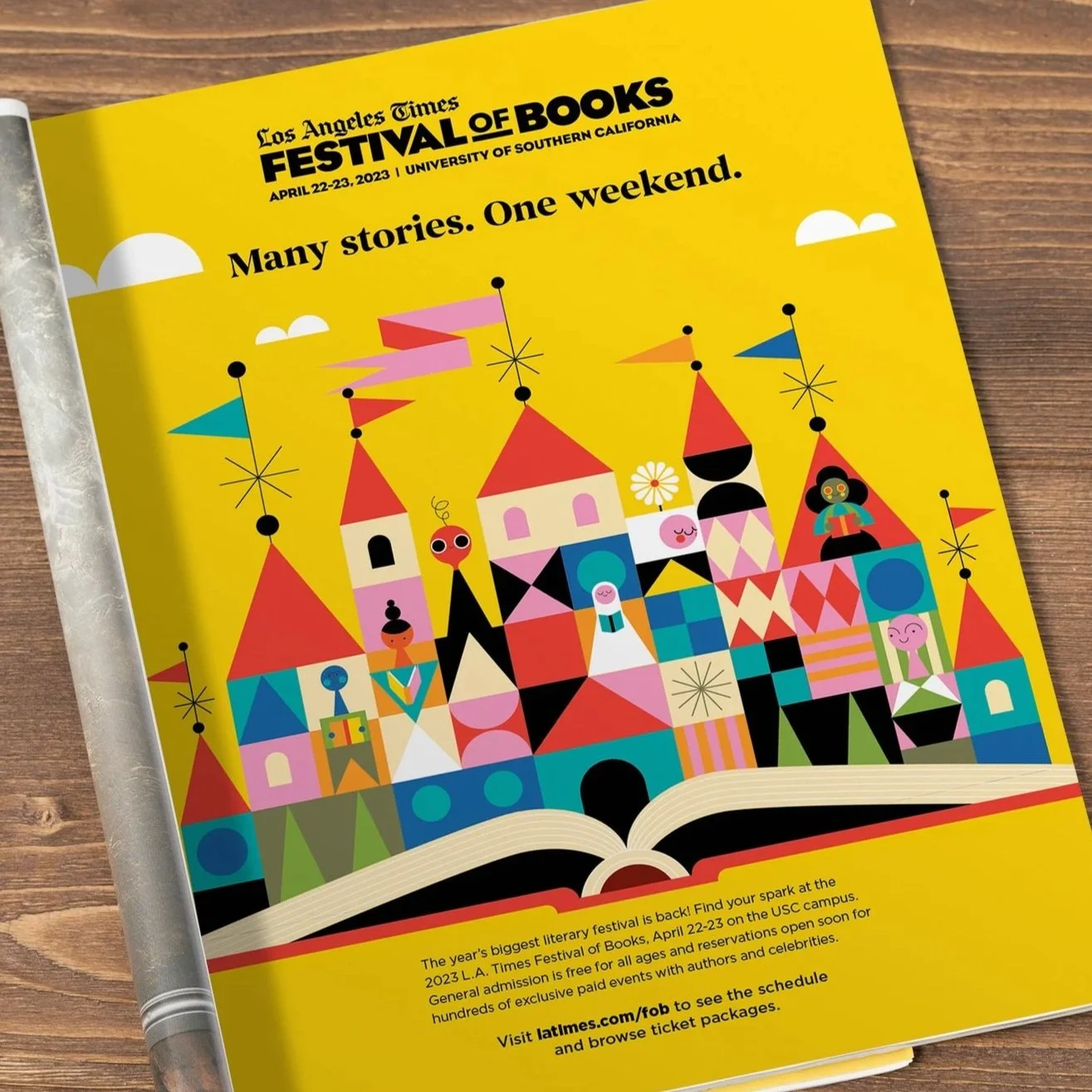
Festival of Books
FLLXc9fUYAUU-b0.jpg
0
SoCal Gas
rams-thumb.png
0
L.A. TIMES
C2C-2023-Look-Feel-R1nca-11.png
0
Coast to Coast
DCS_8943_PB_VIPBox.JPG
0
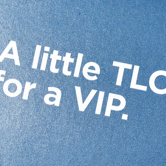
Papa & Barkley
icon.jpg
0
The Big Idea
  Art Direction/Styling: Noel Adolph Photography: Ron Essex/i4color Retouching: i4color Copywriter: Perry Portugal
1
Burt's Bees
glad_ware_ad.jpg
2
Glad MatchWare
98279215643413.5629548a9ec46.jpg
0
Diamond Newsletter 2
burts_kiosk1.jpg
4
Burt's Bees
dbf87312137927.56257de647d03.jpg
4
Kingsford
1HVR1.jpg
3
Hidden Valley Farmhouse Originals
7
Clorox Bleach
butterwax1.jpg
2
Armor All Butter Wax
laura_bakes_tower.jpg
4
Laura Bakes
1urban1.jpg
3
KC Masterpiece/Kingsford
MADMEN_INSERT_S2.jpg
2
Clorox Bleach
STP_PERRY3.jpg
4
STP
8
The Clorox Foundation
CDIFF2.jpg
2
Clorox Commercial Products